Medication Management App
UX/UI Design Project Case Study
This micro case study offers a glimpse into my UX design process for the prototyping of a new product. It is a personal project I have created to demonstrate my skills in design thinking.
Areas of work highlighted:
Problem & Goals > Research & User Personas > User Journey > Wireframes > Visual/Interaction Design > High Fidelity Mockups > Usability Testing
The Problem
Many patients and caregivers struggle to stay on top of medication schedules, dosages, and refill dates. Traditional methods—like paper lists or scattered digital reminders—can be confusing, leading to missed doses and potential health complications.
PROJECT GOALS
- Centralize Medication Info – Provide a clear overview of all prescriptions, including dosage guidelines and refill dates in one place.
- Improve Adherence – Offer intuitive reminders and alerts that reduce the likelihood of missed doses.
- Enhance Clarity – Use a clean, accessible design so diverse users can easily update and review their medication details.
- Simplify Communication – Enable convenient sharing of medication records with healthcare providers or family members.
Research Summary
I conducted research and brief interviews with a small group of individuals who take multiple medications daily or manage prescriptions for loved ones. The key findings revealed:
Missing Doses: Many users relied on scattered reminders and often forgot to take or reorder meds on time.
Complex Schedules: Users struggled with complicated timing, especially when dosages varied across the day.
Limited Digital Tools: Most respondents had tried various reminder apps but found them either too cluttered or not specialized for medication tracking.
User Personas
Diversity ensures the design is inclusive and addresses the unique challenges faced by all users.

Meldrick, age 70
An older adult with limited tech experience. Prioritizes a simple, accessible interface with large text and straightforward navigation to reduce confusion.

Annette, age 36
A busy professional juggling work and family commitments. Needs quick-access reminders and an at-a-glance dashboard to prevent missed doses.
User Journey / Flow Map
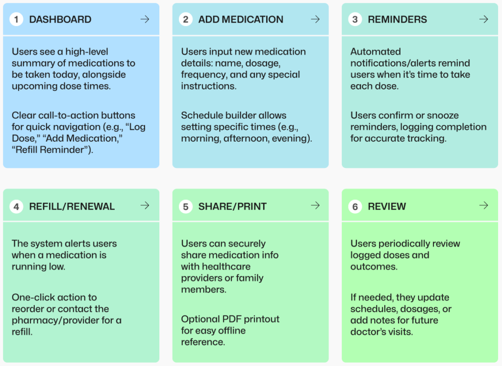
This journey map visually outlines the key steps a user takes—from logging daily medications and setting reminders to managing refills—emphasizing an intuitive, user-centric process that streamlines medication management.
Wireframes
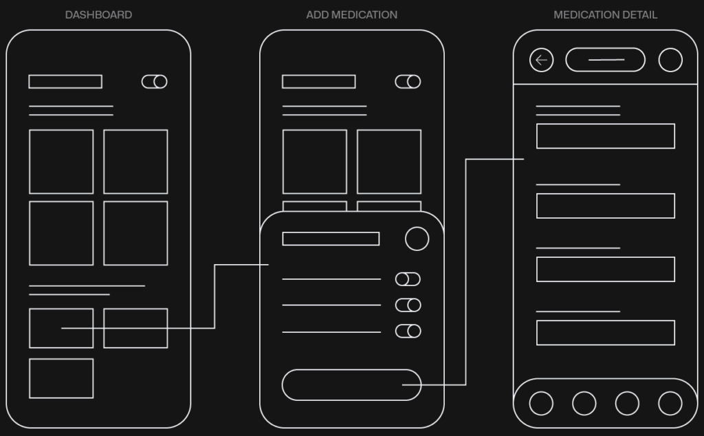
These wireframes are intentionally minimal, focusing on layout and core functionalities to quickly iterate and gather feedback.
Visual/Interaction Design
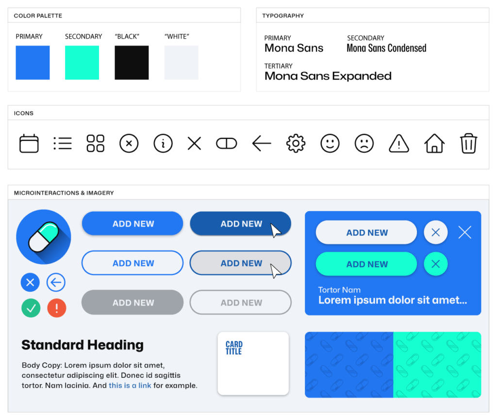
The visual design of the Medication Manager app should be sleek and user-friendly, blending a calm, accessible color scheme with clear typography and subtle interactive cues. The design aims to create a reassuring experience that communicates trust and clarity, while ensuring usability for diverse audiences.
High Fidelity Visual Prototypes
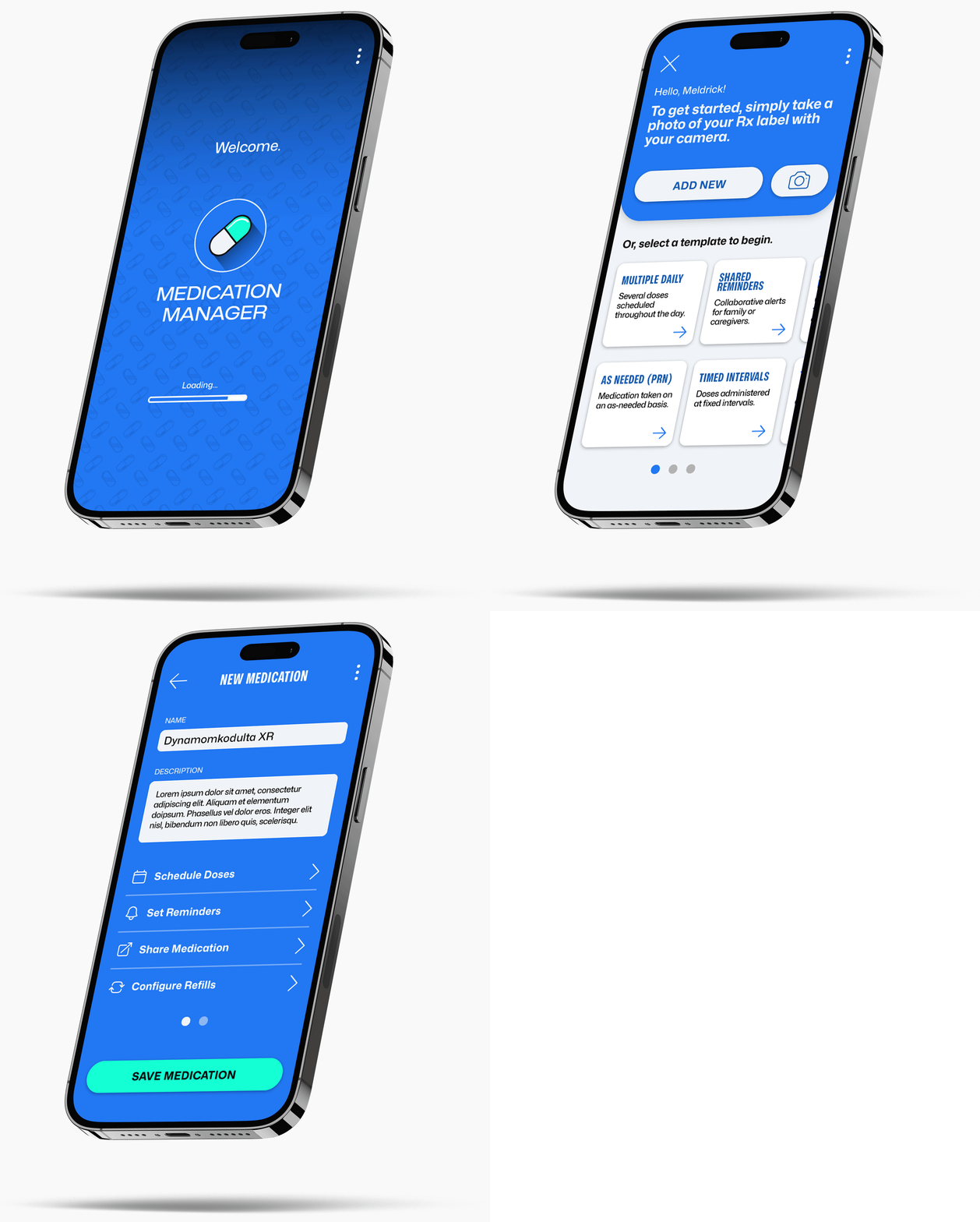
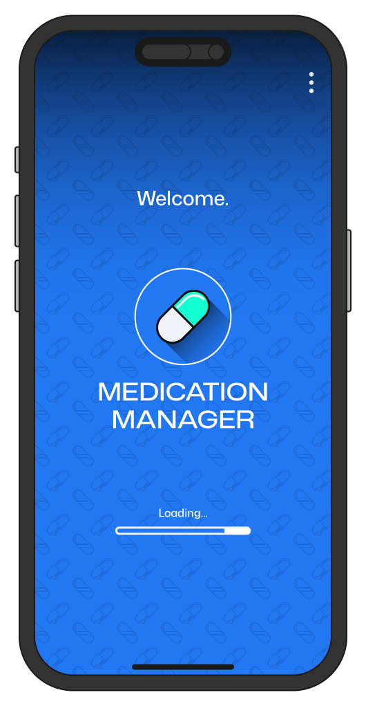
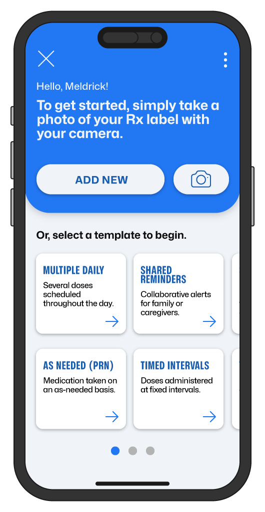
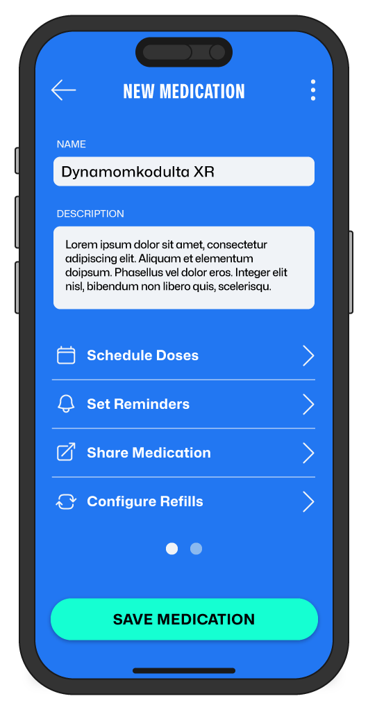
Here are a few sample high fidelity mockups showcasing the refined designs: a smooth loading screen, the first step of adding a new medication, and a detailed view of a medication entry. These mockups highlight polished UI elements and intuitive interactions designed for the Medication Manager app.
Usability Testing
I conducted usability tests with several participants, each managing multiple daily medications. Test sessions focused on core tasks such as adding new prescriptions, setting reminders, and logging doses taken with static mockups showing key screens.
KEY FINDING HIGHLIGHTS
- Navigation Confusion
- Several users were unsure how to access the “Edit Medication” screen.
- Improvement: Added a clearly labeled “Edit” button with a pencil icon next to each medication listing, reducing confusion.
- Reminder Settings
- Participants appreciated the reminder functionality but felt the scheduling interface was too cramped.
- Improvement: Redesigned the time picker to a simpler dropdown menu and added a progress indicator for scheduled doses.
- Notifications & Alerts
- Older users found the notification text too small and easy to miss.
- Improvement: Enlarged the font size, increased contrast, and added a brief animation that highlights the notification section.
After implementing these changes in the mockups, follow-up sessions showed quicker task completion times and higher satisfaction ratings. Users particularly noted how the clearer editing options and more visible alerts improved their confidence in medication tracking.
Work in Progress…
From here, these designs will continue to evolve, be tested and iterated on. I hope to post an update when I get a demo of the app in action as soon as time permits.
Stay tuned for that and more of my design side quests by signing up to my newsletter for email updates!